Tuesday, November 22, 2011
Monday, November 21, 2011
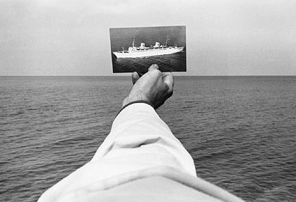
That’s what photographers do. We live in a 3D world, but a photograph is a 2D representation of that world. Back in the 70s, Kenneth Josephson proved that point most humorously with this ship that could just as easily have sailed over someone’s head, or perched atop a building, or — if flipped to the other side — existed as nothing but a blank square.
Not that sculptors haven’t tried to control the vantage point from which their 3D objects are viewed.
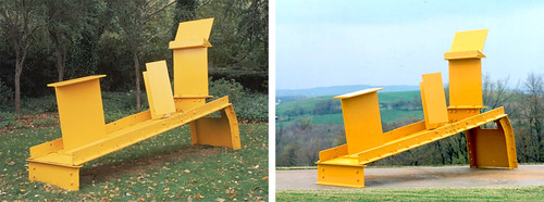
A man after my own heart, control nazi (with a small “n”) Anthony Caro decided back in the 50s to dispense with all that “viewed in the round” crap that most sculptures in modern times adhere to. His pieces were often built to look good from one angle, and one angle only. Take that, messy free thinkers!
But generally, it’s easier to control perspective when you only have to define two dimensions, since you don’t need to deal with peeps nosing around the “wrong side” of things.
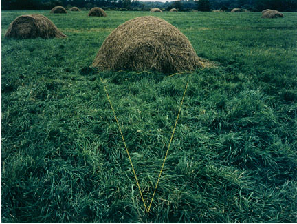
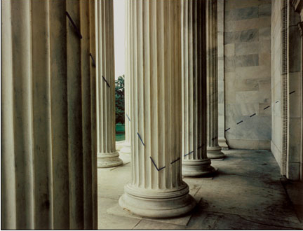
In the 70s, crazy John Pfahl took perspective control to absurd levels. Elements were arranged within the picture plane and then photographed to line up perfectly. Easy, right? Can you tell that I’m going somewhere with this?
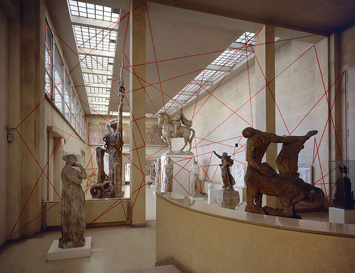
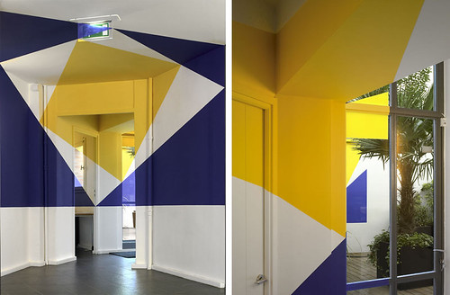
Check out this image by Felice Varini. It’s kind of a funny nod to Caro’s work and sculpture in general, sort of like, “hey — this is the right way to look at these sculptures. Stand right HERE. Or else.”
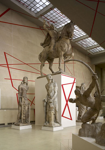
Because if you don’t, everything goes to hell in a handbasket. Pronto, good buddy.
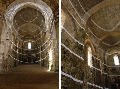
And here is where I get all nutty about Varini’s insanely awesome 3D sculpture/images, because they appeal both to my obsessive photographic need to frame, and to my real life (nascent) understanding that if perfection is possible, it is certainly fleeting. Just don’t move and inch, and everything looks… perfect.
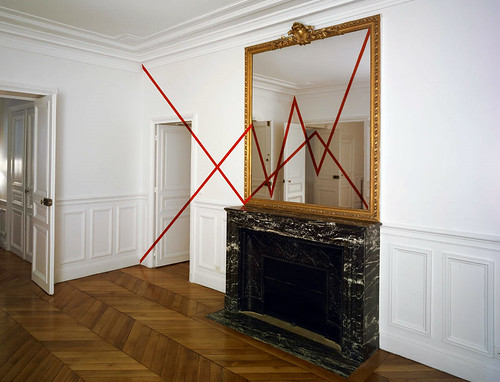
This is one of my favorites because it looks so simple.
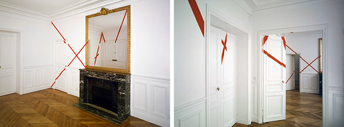
Sike!
Enough lecturing. Here’s where I present you with an avalanche of Varini’s eye candy. More than anything else I’ve seen recently, I wish I could see his works in person. The level of detail, the labor involved, the utter INSANITY of watching your environment morph as you change vantage points — it all just wrecks my mind. I love it.
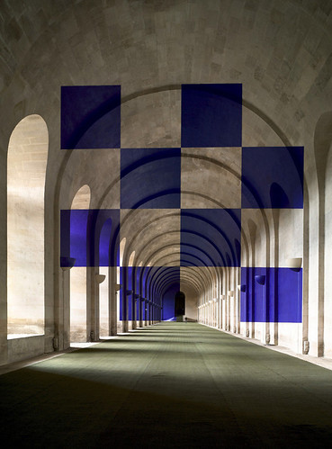
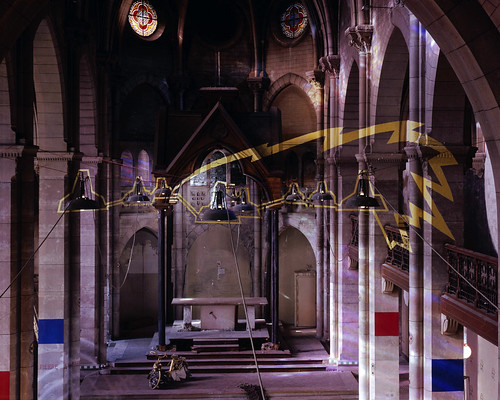
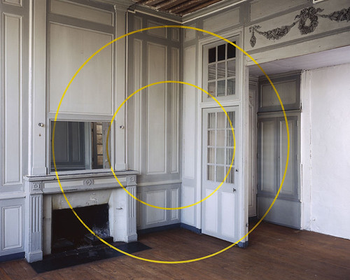
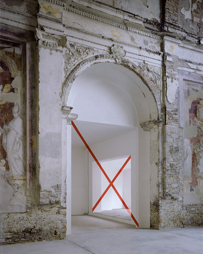
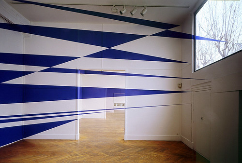
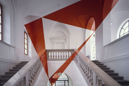
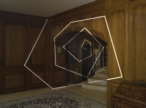
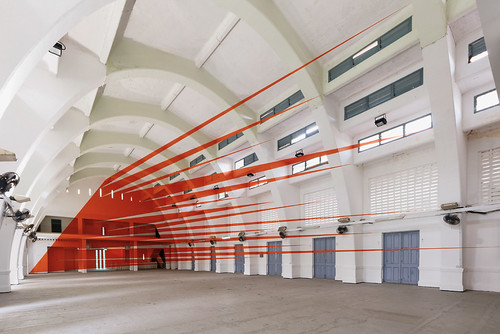
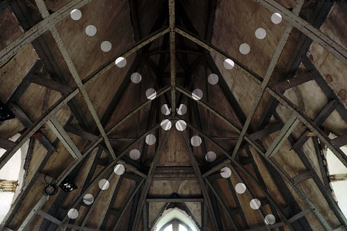
Did I say that I wanted to paint a supergraphic in the baby’s nursery? Silly me! I want to paint a Varini in the nursery. Oh, and I would also like to move my house into a centuries old cathedral, but that’s another story.
Although, Baby Gigantor (the current frontrunner for his name — do you like it?) might be better off with something like these parking garage murals with controlled vantage points from Axel Peemoeller:
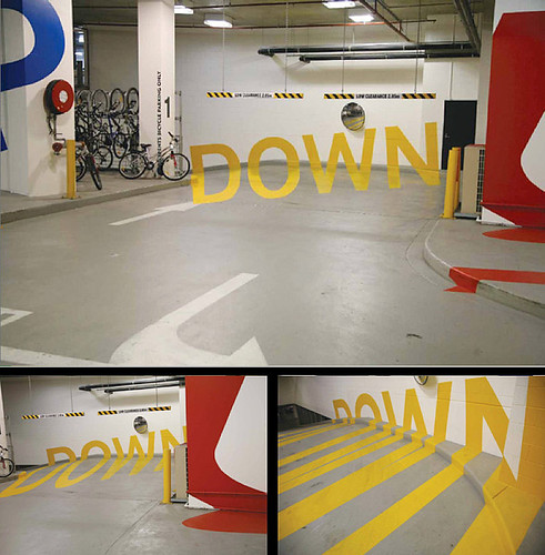
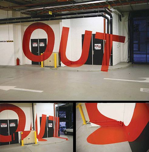
Any child of a self confessed control freak needs to learn how to take directions at an early age.
Wednesday, November 16, 2011
Fun optical illusions
Which line is longer than the other?
If you compare the center angles, which one is the largest?
Which two lines are parallel?
If you look at the center, there are two parallelograms.
Which one do you think bigger?
Which nun is the tallest?
Wednesday, November 2, 2011
Press Release:
Elizabeth Dee is pleased to present an exhibition by Mika Tajima featuring a series of sculptures and painted wall panel forms. This new body of work continues Tajima’s interrogation of the performer and the built environment, of how space and objects shape human activities, drawing on the analogies of the music recording studio, film production set, and office work environment — places where types of performances occur. In this exhibition, the figure of the performer is undetermined; instead, an inventory of improbable spaces and abstract representations proposes a variety of new zones, surfaces, containers, and potentials. The multitudinous display acknowledges their diverse modes of circulation as visual representations, creative production, and backdrop settings for activity.
The gallery floor is occupied by several sculptures repurposing an original 1970s Herman Miller Action Office system, the pre-fabricated modular wall panels of the first office “cubicle”, which Tajima sourced from a recently liquidated telemarketing center. At the time of its first use, Action Office was considered to be the optimal spatial configuration to foster productivity and shape social interaction. The designer described the structure as “a place for transacting abstractions” for the performing worker. Its wayward legacy as the progenitor of hyper-industrialized work spaces is rendered here as a system closed on itself in functionally absurd, and conceptually provocative configurations: sealed cubes and an open-faced wall mural. The areas they define are inaccessible or irrational, and as a result, the sculpture’s spatial presence pushes outward to its surfaces. On some panels, Tajima has re-stretched and re-painted the original blue-grey canvas panels as vibrant monochromes; on others she has attached silkscreen prints utilizing the painting surface as a bulletin board. The networked panels extend into the surrounding room as a sculptural form creating a topology that redirects the form’s continuing closure.
The gallery walls are lined with a new iterative series of works titled Furniture Art, which are reverse spray painted acrylic frames arranged in gridded formations. These transparent frames contain abstract blooming paint mists and candy monochromes—sometimes delineated by hard-edged architectural patterns that reveal their multiple surfaces. Furniture Art refers to Erik Satie’s Furniture Music (Musique d’ameublement), a series of infinitely repetitive compositions meant to be background music for different occasions (aural decor). Each Furniture Art piece is subtitled by a geographic location—Santa Fe, Tokyo, St. Croix, Moscow, etc.—drawing on the specific psychogeographic associations that are produced by affective naming of colors and paints. Two large scale acrylic pieces sized akin to the cubicle panels bring the associations full circle—an amalgam of the Action Office wall panel and spray painted shell forms.
Placed within the installation and in front of Furniture Art configurations are vintage ergonomic kneeling chairs designed to shape the body to perform desk work. In the exhibition, the chairs create new positions for viewing the works, transforming the viewer into a different kind of performer.
If the decor must be changed, these objects are not exempt.
Tabaimo: Dandan
Mika Tajima is a New York–based artist whose latest project, The Architect’s Garden, is on view until December 17 at the Visual Arts Center at the University of Texas at Austin. Tajima’s site-specific installation is accompanied by a program of events, including a conversation she had with Richard Linklater, director of the 1991 film Slacker. Her latest body of work continues to excavate the social implications of contemporary built environments, and the concomitant development of particular kinds of human performers, such as the flaneur, the slacker, and the good worker.
I DON’T GO TO HOME DEPOT A LOT, but I recently went to the paint section looking for two specific colors, a royal blue and a rusty brown. It’s an easy place for me to select industrialized mixed colors and coincidentally complements the idea behind The Architect’s Garden. The experience of picking colors is bound up in the brand’s dreamy affects—the Ralph Lauren Collection or the Martha Stewart Collection—and reading all the evocative, predetermined color names. One of my favorites was Soul Sister, which is a deep purple, and there’s one called Lion Heart, which is a soft yellow. The exhibition includes an ongoing series of spray-painted Perspex paintings linking visual abstractions to geographic locations—smoky gray and sunglow orange in Furniture Art (Malmo), or banana yellow and gold in Furniture Art (Belize City)—projections of those places, taking you there.
I’ve been thinking a lot about Richard Linklater’s Slacker, which was made in Austin twenty years ago. When I was growing up in Austin, the local resistant figure was, and maybe still is, the slacker. The slacker––not to be confused with involuntary underemployed––makes self-determined choices not to do something—to refuse or strike with little effort. For me, the psychogeography of the film is the polar opposite of an overtly structured environment, like Herman Miller’s Action Office, the first designed cubicle spaces in which work and social interaction were organized to control/produce life’s abstractions. The figure of the slacker is a critique of those systems that regulate bodies and space. It represents the potential possibilities around or at the edges of these regulated places and logics. Slacking is nonperformance in the face of post-Fordist total life.
In our discussion, Linklater talked about how slacking in the film was an aggressive response, a way to be a nonparticipant in a society you don’t see much point in. Perhaps we need the slacker now more than ever, as we hurtle toward an overbuilt negative utopia. The characters in Slacker are having this conversation in 1991, during a time when Austin was pretty removed from commercial development. There’s a character in the movie who says, “I have much more important things to do than work a day job, and when I have my true calling, I’ll know it.” Or the hitchhiker who says, “I may live badly, but at least I don’t have to work to do it.”
The characters’ conversations remain prescient. Big box stores, highways, overbearing condominiums and fancy hotels that, even if they are rapidly (and shoddily) built, remain half full or totally empty. There is a new luxury construction in Austin that opened last year. It’s been riddled with construction failures, including windows falling from balconies and crashing to the ground from above—and the building’s slogan? “Whatever/Whenever.”
By making space for nonprescribed functions in The Architect’s Garden, I’m trying to create a structure for slacking. Similarly, in my previous work a painting becomes a double-sided bulletin board, or another architectural element, skirting an object’s normal role or adding other purposes—productive or not. Slacking is a mode of refusal. Perhaps the best representation of the slacker painter is the monochrome.
— As told to Andy Campbell
Subscribe to:
Comments (Atom)


